About Drip.
Drip is a small website created for the University of Sussex's Web 3D Applications module. Its source code is available here.
I followed a coffee theme, modelling a few brewing devices (a Moka pot, a Chemex, and an AeroPress). Each of these items is showcased in the website, along with a few interesting facts about them.
3D Models
All 3D models were built from scratch in Blender, and then
exported as .glb files. Various materials were used across
models, some taken from
BlenderKit
and some (simpler ones) which I created myself.
All models have a fairly high polygon count. They could be greatly optimized
by reducing the geometry (via a decimate modifier, for example,
which I did use on the Moka model), but for this project I wanted them to
feel as detailed and polished as possible, even at the cost of performance,
especially considering that this website only ever render one model at the
time.
For consistency, each model has a single animation which operates the same
way in all of them: it 'disassembles' the item into its components (and
're-assembles' it when played in reverse). They all use keyframes for
translating and rotating these components, without the need for more complex
approaches (like setting up armatures).
Because of the high level of detail in the models, this approach is still
satisfying and, I think, quite functional, allowing to take a deeper look
into how these brewers are made.
Moka
The Moka pot was the first object I modelled, and by far the one I spent the most time on.
The body of the model is made of a mix of sharp edges/corners and
smooth joins. For this, I used auto-smooth, setting
sharp edges when needed, which gives the desired
industrial, 'unpolished' effect.
The handle, top knob, and the filters required much more detail, so
they were given a subsurface modifier. This resulted in
a very high polygon count, exporting to a very large
glb file. I did reduce it by applying a
decimate modifier to them afterwards, which
unfortunately also ruined the geometry of the object, which is now
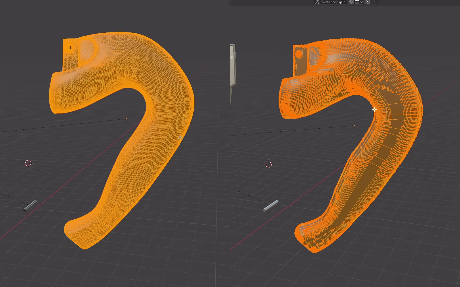
extremely messy, made of what seem to be random polygons. The before
and after is shown in figure 1: the result is
messier, but the vertex count was reduced from 46887 to
25212, a still high amount by all means, but also a
significant reduction.
Because of my lack of experience, I also ended up doing a lot of
manual work connecting vertices and reshaping faces, which, with
insight, could've been done much faster and with better results by
using the correct modifiers and other tools (such as using
creases instead of marking sharp edges).
Chemex
The Chemex was the second object I designed, likely the simplest overall.
This model is made of mostly smooth surfaces, so all of the components
(besides the rope) were given a subsurface modifier. The few
'sharper' edges were handled by simply adding more
edge loops or adjusting their crease value.
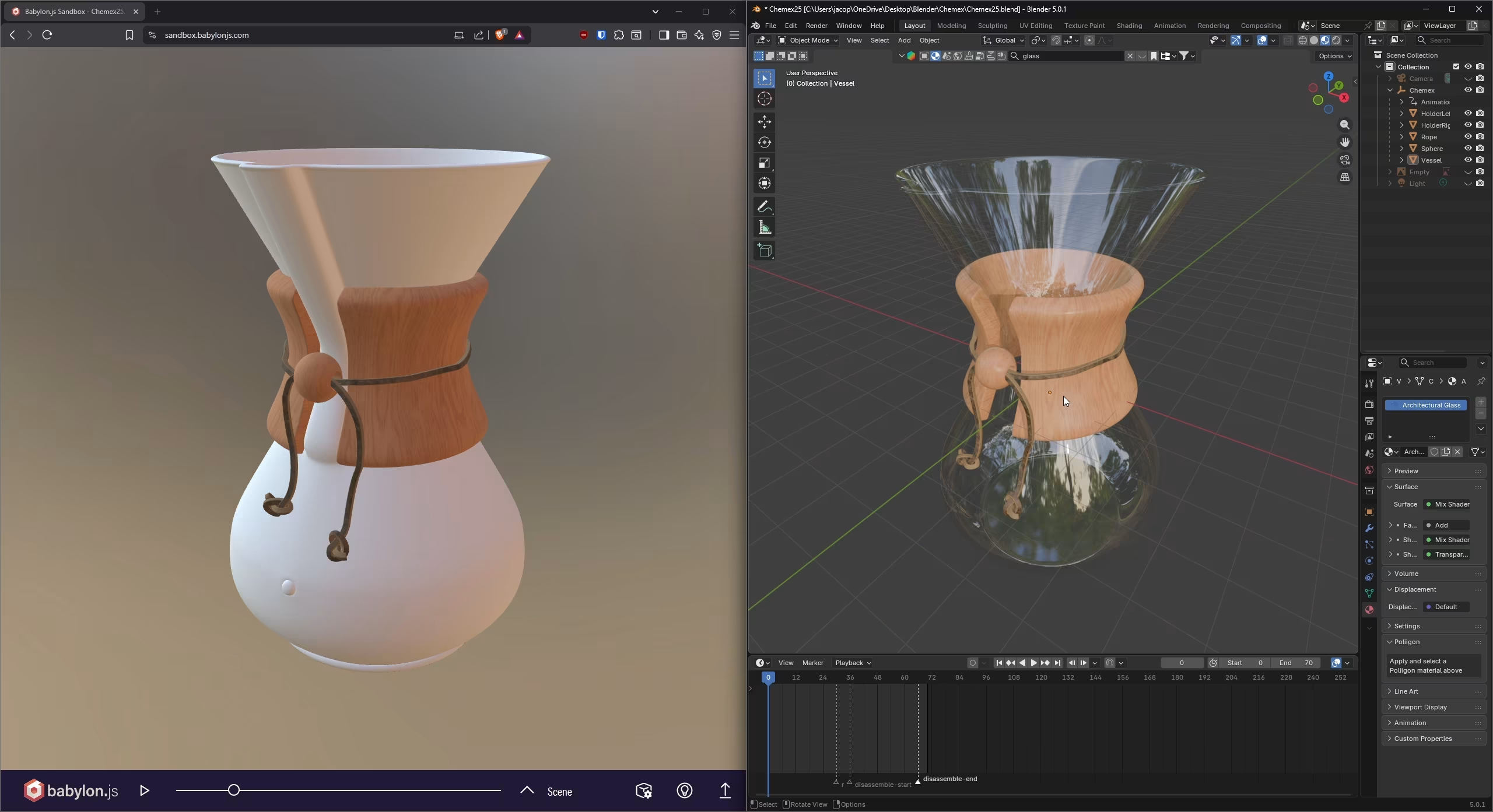
One of the main challenges I had with this model was creating the
glass-like material. I initialy tried to use some pre-built
materials from
BlenderKit, but none of them exported well to
glb, resulting in either weird artifacts, or not
showing at all (as shown in figure 2). I ended up
creating a custom one, which required a lot of trial and error to
look right.
The second main challenge was animating the rope, for which I tried
many different ideas:
geometry nodesto fade it out layer by layer.-
turning it into a
curveand keyframing itsbevel levelto 'fade it out' from one end to the other. -
using
soft-bodyandclothmodifiers to simulate 'untying' the lace and remove it from the Chemex. -
just fading it out by keyframing the material's
alphavalue.
All of them worked (to various degrees) in Blender,
but none exported to glb. I was stuck on this for an
entire day, until I eventually decided to instead animate the rope
by simply 'stretching' it.
I have done so by keyframing two state keys: the base
state, and the a 'stretched' version, which accounts for the other
components' positions at the end of their animation. To do this, I
simply manually stretched the mesh using
proportional editing to ensure the shape stays
consistent as I move and stretch it around. The overall result is
far from what I hoped to achieve, but it's good all considered!
AeroPress
The last model I developed, and the one I am most proud of, as I think it
has the best balance of detail and simplicity. I particularly like the label
being 'embedded' into the outer, plastic tube, and the see-through effect of
the main body. The latter was a big hurdle in the Chemex model, while this
time I figured out how to make a good looking see-through material, by
learning the proper difference between
alpha (transparency) and transmission.
For the label, I added text to the model, using a font that best matched the
original, and I then converted it to a mesh, applying a
decimate modifier to it to greatly reduce its geometry. Lastly,
I used a shrinkwrap modifier to 'wrap' it around the tube. The
original idea was to then apply a boolean modifier to 'engrave'
the text into the plastic, but I eventually decided against it, as I
preferred the current look more.
Lastly, for the 'cap/basket' component, I created its holes by making a
cylinder the size of a single hole, then used a couple of
array modifiers and a boolean modifier to 'cut' a
series of holes into it, matching the real-life pattern.
The pattern on the side, however, was a more difficult and manual process,
basically extruding and deleting extra-faces to get to the desired look.
Animations follow the same pattern as the rest, basically taking the components apart by keyframing them: the cap rotates and moves down, revealing a paper filter in the process, while the plunger is pulled up. It is simple but I really liked it, especially paired with the see-through material.
Design
The website style is fairly simple: sharp borders, corners and shadows, boxy sections , and a warm color scheme consisting of shades of brown, orange, and black used for good contrast and readability. This was done using a mix of Tailwind and custom CSS.
I wanted to keep the layout simple as well: all pages have a consistent header (used for navigation), and uses boxes to organize various content. Elements shrink and grow with the screen, switching between row and column layout when needed, and some non-essential content (such as the carousel images in the index page) is hidden on smaller screens to avoid clutter.
Semantic HTML elements are used throughout the website, and
alt attributes were used for all images, for accessibility. Screen
readers support however, was not a priority: considering the main focus of this
website is the 3D models, there would be no way to make it fully accessible to
visually impaired users regardless, so I didn't focus too much on it.
Integration
To display the models in the website, I used an Model-View-Controller (MVC) pattern. The core components are:
-
model-viewer.html— The view component, responsible for the UI. It sets up the canvas element in which the 3D model itself will be rendered, all of the buttons and controls needed, and a cointainer element in which some extra content (text, videos, and pictures) will be loaded, depending on the model chosen. All of these elements by themselves are 'dumb', their actual functionality or content is injected by the controller at runtime. -
src/model-viewer.ts— The controller component, responsible of linking the view to the models, serving as the logic layer. When loaded, it fetches all of the needed UI elements and adds listeners to actually make them functional. Additionally, it handles loading and switching between models, injecting the relevant content (based on the model chosen) into the page. -
src/models.tsandsrc/scene.ts— The models component.models.tsdefines data about the models available, whilescene.tsdefines a class that encapsulate the entire 3D scene, treating it as a single entity which holds all the needed components (such as the renderer, camera, model, etc). This is especially useful as it allows the controller (src/model-viewer.ts) to be leaner, focusing on just 'syncing' the UI with the state of the application.
As mentioned, besides the 3D model itself, additional content is loaded into the
page according to the model chosen. This content is kept in the
public/info folder, in the form of
HTML 'fragments' (such as
public/info/aeropress.html), which is simply fetched and injected
into the page at runtime.
The content itself is just in order to add a bit more 'personality' to each
page, adding some details about the object shown (such as its history and fun
facts), in the form of text, images, and videos.
Interaction
The user can select an object either from the carousel in the
index page, or directly from a dropdown in the
models page. This allows the user to inspect the 3D model of
the selected object in the canvas element discussed earlier. The user can
interact with the canvas itself to rotate, pan, and zoom the camera (the default
behaviour provided by OrbitControls). Additionally, the user can:
- Toggle the wireframe view on and off.
- Change the background environment of the scene, choosing from a list of available ones.
- Adjust the camera FOV.
- Adjust the color and intensity of a spotlight present in the scene (to play with with the shadows and overall mood of the scene).
- Trigger the object's animation.
- Reset the scene state to the defaults (this resets everything listed above, including the camera's position, excepts for the model loaded, its animation state, and the environment loaded).
Most of these controls are accessible inside a menu in the 3D canvas, by
clicking the hamburger menu at the top-right of it.
The only exception is the animation, which is triggered by a button on the
bottom-left of the 3D canvas, since it is not really a 'scene' setting, but
rather a property of the model itself. This button is labelled
Disassemble when the model is in its default, assembled state,
and Re-assemble when the model is disassembled, allowing to
play the animation in both directions, depending on the state of the model.
Implementation
I tried to keep the tecnologies/packages used to a minimum. I wanted to avoid relying on CDNs, and instead opted to use npm and Vite so that I could better manage dependencies and bundle only what I needed in my production builds, resulting in better performance and a lighter application overall.
I considered using Svelte for ease of development, but I decided to keep it simple and go framework-less, since the project itself is fairly small. This kept the project very simple, consisting of only a handful of HTML and TypeScript files (besides the assets). On the downside, it resulted in more work, having to manually fetch elements and set up event listeners, and some repetition in the codebase (such as the navigation bar being repeated across all HTML files). While annoying, the repetition is not a big issue considering the small size of the project. If the project was to ever grow in complexity, I would definitely switch over to Svelte or the likes.
Testing Strategy
Similarly, my testing strategy was also very simple: all of the testing was performed manually as features were implemented. This is because, again, the website is quite simple, with a small number of features, most of which are visual anyway, meaning automated testing would have likely only accounted for a very small portion of the functionality.
As part of the final testing, before submission, I had the following checklist, covering most of the application's features:
| Test | Pass |
|---|---|
| Home | |
| Navigation bar links redirect to correct page, including the logo. | ✓ |
| Each carousel item redirects to the corresponding model's page. | ✓ |
Clicking left transitions to the previous model,
wrapping at the start.
|
✓ |
Clicking right transitions to the next model, wrapping
at the end.
|
✓ |
| On mobile, carousel images are hidden. | ✓ |
| On desktop, carousel images are displayed. | ✓ |
| Models (general) | |
| Navigation bar links redirect to correct page, including the logo. | ✓ |
URL attribute ?model=aeropress correctly loads the page
with the AeroPress model selected.
|
✓ |
URL attribute ?model=chemex correctly loads the page
with the Chemex model selected.
|
✓ |
URL attribute ?model=moka correctly loads the page with
the Moka model selected.
|
✓ |
Invalid model ID (?model=test) falls back to the first
model.
|
✓ |
| Missing model attribute in the URL loads the first model by default. | ✓ |
| 3D canvas viewport resizes correctly with the screen (instead of stretching). | ✓ |
| Scene Controls | |
Menu button opens the controls panel. |
✓ |
Close button closes the controls panel. |
✓ |
Wireframe checkbox correctly toggles wireframe mode on
and off.
|
✓ |
Selecting a new environment from the dropdown correctly
updates the scene.
|
✓ |
Every single environment loads when selected (no
missing assets).
|
✓ |
Background blur slider blurs the environment
accordingly.
|
✓ |
Camera FOV slider updates the camera accordingly. |
✓ |
Light intensity slider updates the scene's spotlight
accordingly.
|
✓ |
Light color picker updates the scene's spotlight color
accordingly.
|
✓ |
Reset scene button restores all defaults (wireframe,
blur, FOV, camera position, spotlight).
|
✓ |
| AeroPress | |
| Model loads correctly when selected. | ✓ |
| Page content loads correctly when selected. | ✓ |
Disassemble animation plays correctly. |
✓ |
Assemble animation plays correctly. |
✓ |
| On mobile, WAC (World Aeropress Championship) video displays below the text. | ✓ |
| On desktop, WAC video displays to the right of the text. | ✓ |
| Chemex | |
| Model loads correctly when selected. | ✓ |
| Page content loads correctly when selected. | ✓ |
Disassemble animation plays correctly. |
✓ |
Assemble animation plays correctly. |
✓ |
| On mobile, the 'Chemex appearances' gallery stacks vertically. | ✓ |
| On desktop, the 'Chemex appearances' gallery stacks horizontally. | ✓ |
| Moka | |
| Model loads correctly when selected. | ✓ |
| Page content loads correctly when selected. | ✓ |
Disassemble animation plays correctly. |
✓ |
Assemble animation plays correctly. |
✓ |
| On mobile, the Moka x-ray video displays below the text. | ✓ |
| On desktop, the Moka x-ray video displays to the right of the text. | ✓ |
Deeper Understanding
01. Going framework-less
This was the first time I have developed a non-trivial (web-based)
project without relying on a
JavaScript framework (such as Svelte,
React, or Vue).
It was a refreshing experience. Having to manually sync the UI to the
application state (like fetching elements and setting up event
listeners) is something that I rarely do otherwise, instead relying on
the framework's way to handle reactivness. This more hands-on approach
was a great way to practice some fundamental web development skills, and
get a better understanding at how these reactive frameworks might work
under the hood.
The deployment process was also a bit more involved than usual.
Normally, I would just rely on some platform like
Netlify to handle production build and deployment. This
time, I had to manually build the application and copy the result to the
university's server, which admitedly is a very simple process, but
required me to be a bit more mindful of how Vite itself
works.
02. Learning Blender
This module was my first proper introduction to
Blender and 3D modelling. I really enjoyed working with
it, especially the sense of progress I felt, as each new object I model
felt faster, simpler, and overall better than the previous one.
I feel like I learned a lot about materials, modifiers, tools, and the
general modelling workflow, yet I can't help but feel like I only
scratched the surface of what Blender can do. Still, I
am very happy with all three models (even if some are deeply flawed)!
03. Three.js and MVC
This module was also my first ever introduction to
Three.js.
I felt quite overwhelmed at first, as even a simple scene requires a lot
of components and code to setup. This, I think, was the main reason that
pushed me to use the MVC pattern, to try and abstract
away the bulk of the logic and state related to the 3D scene into a
dedicated class. This helped me greatly to wrap my head around each
component, and easily adjust the scene setup.
I tried to keep the scene controls and interaction simple, just adding a
few features that I thought could be effective. Probably the best
feature I added was using environments (HDRI) as
background, which made the scene feel more 'alive', as well as providing
some nice, natural ambient lighting and reflections.
As with Blender, I feel like I have much more to learn
about Three.js.
04. Blender vs Three.js
During development I struggled significantly when exporting 3D models to
glb files. I learned that just because something works in
Blender, it doesn't necessarily mean it will export and
work in Three.js.
It was for the most part a trial and error process, exporting the model,
testing it in my application, and checking if everything worked as
expected. I found that a lot of pre-made materials didn't render
correctly (if at all) in Three.js. This was especially
problematic for see-through materials. For these, I eventually just
realized that it was easier to just make simple, custom materials
myself, which might not be as polished as the 'professional', pre-made
ones, but saved me a lot of headaches.
The same goes for animations, I found that keeping it simple was the
right call for this project.
Implementation & Publication
I added this page (about.html) to provide insight into the
application and 3D models development, covering all sections and points (as they
appear in the checklist given in week 10) as best as I could.
Submission
GitHub was used for version control during development. As part
of my submission, I have downloaded the repository as a ZIP file, testing that
it could be opened and run without any issues. As part of the codebase, in the
root, there is a README.md file, which includes instructions on how
to run the application.